French Calm, Mid-Century Colour: What This Retreat Taught Me
Right now I’m tucked away on a solo retreat in the middle of nature. It’s all French styling and old-world charm here - linen curtains swaying in the breeze, timber furniture with history etched into every grain, and even an outdoor copper bathtub that feels like it was made for slow evenings and long sighs. Everything here whispers: slow down.
And I have.
But somewhere between the quiet contemplation and cups of tea, doubt crept in. Saint Atlas, my world, is about colour and boldness. About interesting things, playful pieces, and the thrill of discovery. Sitting here in this soft, neutral, restrained space, I found myself wondering: does what I do even belong in a world like this? I was having an identity crisis.
A French Foundation
The French know how to make rooms feel timeless. Stone floors, linen, chipped paint that somehow looks chic instead of shabby - it’s all very calm and grounding. It’s a canvas, really. And that’s the key word I kept circling back to: canvas.
Because a canvas doesn’t have to stay blank.
Enter Colour, Mid-Century Style
The French details were already so graceful, calm, and timeless. But my mind wandered to how mid-century accents could weave in - never to compete, only to converse. A mustard velvet chair tucked into a corner. A cobalt lamp perched on a rustic console. Perhaps a bold rug underfoot, burgundy against the pale linen.
With just those touches, the atmosphere shifts. The essence of French charm remains untouched, but it hums with new energy.
That’s the beauty of mid-century design - it knows how to play without overwhelming. Teal, ochre, forest green, burgundy.. those colours don’t drown out the French foundation. They elevate it.
Where Saint Atlas Fits
And that’s when it clicked. Saint Atlas isn’t out of place here - it’s the punctuation. The little exclamation mark in a sentence of calm. Colour only feels loud when there’s nothing grounding it. But placed against French restraint? It becomes poetry.
So maybe slowing down isn’t about stepping away from colour. Maybe it’s about letting colour have room to breathe. About giving it the stage it deserves.
The Lesson I’m Taking Home
French styling and mid-century design don’t compete. They dance. One is calm, one is bold, and together they make something balanced and beautiful.
And maybe that’s the balance I want for Saint Atlas too: a little calm, a little bold. A little French charm, a little colour-driven energy. Because when the two meet, that’s where the magic really happens.
--
3 Ways to Add Colour to a French-Inspired Space
1. Start with art.
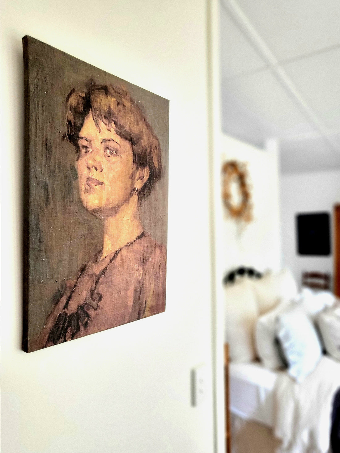
A framed mid-century print or abstract painting in bold tones can lift a pared-back room instantly. Think cobalt, coral, or ochre against pale plaster or linen walls. At Saint Atlas, I love how a gorgeous floral oil painting instantly adds that spark without overpowering a room. And it can absolutely sit alongside antique etchings and charcoal-drawn portraits.
2. Bring in one hero piece.
A single mid-century chair, lamp, or rug in a statement colour is all it takes. French restraint works best when colour feels intentional, not scattered. Something like our Fritz Hansen sofa with red velvet cushions, or our aqua Depression glass candlesticks, would make a French farmhouse room sing.
3. Accessorise with personality.
Ceramics, cushions, or glassware in jewel tones let you test the waters without big commitments. I’ve seen how a gorgeous pink art glass vase or a pair of burgundy glass tumblers from Saint Atlas can transform a rustic French table into something unexpectedly chic.
--
✨ And that’s the beauty of it all: you don’t have to choose between calm and colour. With the right balance, they make each other better.